
IELTS Templates for Task 1 That Ensure 8+ Bands!
First of all, let’s look at the structure you need for task 1 (IELTS Academic) module. Remember, the conclusion is optional.
___
5 paragraphs:
- Paraphrase the question
- Overview (extreme point: average/highest/lowest/fluctuation/increase/decrease/consistent)
- Body 1 (Mention the main points or mention one half of the chart)
- Body 2: whatever is not mentioned in body 1
- Conclusion: 1 or 2 general sentences summing up the chart
__
Now, let’s look at individual charts and graphs. Let’s analyze how you can use effective templates there!
__
BAR CHARTS:
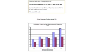
- Vertical-horizontal-and everything in between (A glance at the graph provided shows the GDP..
- There are three things you should focus on: trend (the units are increasing over the years), difference (in 1996, the difference between the two sectors was much lesser than in 2000) and highest/lowest (in 1992 the levels of this and this were the lowest while the same sectors in 2000 were at their peak)
- Body 1: In whatever year, the level of this was the highest, sitting at whatever percent. Furthermore, the lowest level was reached in 2000 when the whatever sector was at this percent and the whatever sector was at this percent.
- Body 2: Likewise, …
- Conclusion: Overall, there was a general increase in…. Overall, there was a major difference between…Overall, this increased this decreased.
PROCESS CHART:
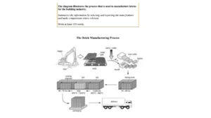
- Any way you can rephrase it (The process portrays several stages in involved the brick manufacturing process).
- The start, middle and the finish (Initially, the process begins with the digger digging the clay which then passes on to the cooling chamber and finally ends up with the delivery truck)
- Mention half of the chart (The process kicks off with the digger…. The next step is… Following that… Also… Afterwards/After that… Likewise..)
- Moving on to the next step, the products go in the packaging station… blab la and finally ends up in the delivery truck.
- Overall, the entire process involves 7 steps.
___
CHECK OUT THE BEST SELLING ONLINE IELTS COURSE THAT GUARANTEES YOUR MARKS OR MONEY BACK!
https://hzadeducation.com/product/classes-ielts/
___
MAPS:
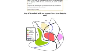
- Any way you can (A glance at the chart reveals a detailed overview of the landscape of Brandfield)
- S1 mainly has whatever around it, while the whatever whatever whatever surround S2.
- To the north of S1, we can see whatever. Likewise, towards the east of it we can see. Also, on the western side towards it we have the
- On the other hand, S2 is near whatever blab la
- Overall, S1 takes care of the people on the northern side while S2 covers the southern area.
PIE CHARTS:
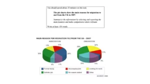
- Paraphrase by exchanging the last two things in the sentence. Again, there are three things in the question so just exchange the last two. The pie charts show the main reasons for migration to and from the UK in 2007 The pie charts show the main reasons in the UK in 2007 for migration to and from the UK A glance at the graph provided reveals the causes that occurred in 2007 that resulted in migration to and from the UK.
- Overview: Look at the extreme points that are common or very uncommon in the two pies. If you can’t find that then talk about the highest and lowest points.
- Option A: The main reason for immigration and emigration was definite job, whereas, the second main reason for immigration is formal study. Ironically, this is the least important reason concerning emigration.
- Option B: The main reason for migration was definite job. Whereas, the least important reason for immigration was “no reason stated” and for emigration it was “formal study”.
- Body 1: Mention the points from the overview. In whatever year whatever was the highest at %, whatever was the lowest at %, whatever was the second highest at %, whatever was the second lowest at %.
- Body 2: Between the two years, there was a major decrease in the percentage of whatever by %. Whereas, the percentage of whatever increased by %. Likewise, the % of whatever remained constant.
- Conclusion. Any 1 or 2 general sentences. Overall, there were major and minor differences in some categories while the others remained constant.
Check out a detailed video here on how to master IELTS Task 1: https://www.youtube.com/watch?v=l-VUYWvDKxo
TABLES:
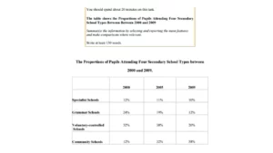
A glance at the graph provided reveals data regarding the four schools and the years 2000-2009, giving information about their percentages.
The central idea of the chart is demonstrated from the downward trend (in percentages) by the first three schools and the rise (in percentages) for the community school.
Firstly, specialist schools kick off with a percentage of x in the year 2000. Following that, it decreases overtime, reaching x% by 2009. Likewise, the grammar schools start with a much higher percentage of x, which then decreases by x% and ends up at x%. Lastly, the voluntary-controlled schools have the largest share of percentage in 2000, sitting at 52% which then drops to x% and comes to x% towards the end.
On the other hand, community schools have very low numbers initially (x%). Afterwards in 2005 and 2009, the percentages soar to x% and x% respectively.
By way of conclusion, among the differences, specialist schools maintained the most minor changes; comparatively.
- Vertical-horizontal-everything in between. The table represents the four different schools from years 2000 to 2009 giving information about the percentages of students.
- Compare the columns and rows and see the trend (mostly with years). The percentage of whatever kept on increasing while the percentage of whatever decreased over the years. Also, the percentage of whatever remained constant.
- Body 1: Group one thing
- Body 2: Group the other thing
- Conclusion: Whatever you have not done in the overview.
LINE CHART:
Six things you wanna focus on:
Constant lines
Fluctuation
Start/Finish
Increase/Decrease
Similarities
High and low
The line graph below shows the percentage of tourists to England who visited four different attractions in Brighton.
Summarise the information by selecting and reporting the main features, and make comparisons where relevant.
Write at least 150 words.
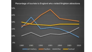
- Vertical-horizontal-everything in between: A glance at the graph provided reveals information about the percentages between 1980-2010, about tourist’s attractions.
- Overview: Six things.
- Body 1: Whatever fluctuated, remained consistent, increased, decreased, was higher than, was lower than…… drastically, dramatically, sharply, rapidly. Constant: It remained constant between whatever and whatever percentage over the years. Fluctuation: This fluctuated between this and this percent over the years.
- Body 2: Everything else.
- Conclusion: Second best overview with the six things.
___
IELTS General/Academic 7+ Bands Course! 15 Hrs! (FREE FEEDBACK)
